- Backlinks Explained: Why Your Backlinks Aren’t Paying Off - April 10, 2024
- Boost Your Agency’s Credibility: A Guide to Online Reputation - April 10, 2024
- URL Slugs for SEO: A Comprehensive Guide - April 10, 2024
Did you know that your main menu is a part of your marketing? It’s true. What your menu says gives your visitors a small indication of what your website is about and whether or not they are in the right place. Main menu mistakes can lead to high bounce rate, low length of time on site, and low rankings in search engines. Worst of all, main menu mistakes directly impact the amount of leads and sales from your website.
After 10 years in the business, I still see the same mistakes over and over again. I don’t think there is a single day that I don’t visit at least 10 websites, of which half are making main menu mistakes. So, I started taking notes of all the main menu mistakes I see on a regular basis, and organized them into this visual blog post for you. Let’s get started.
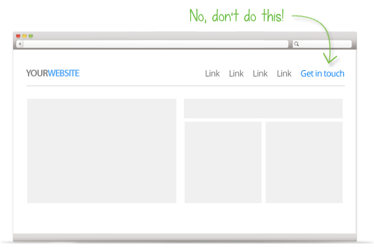
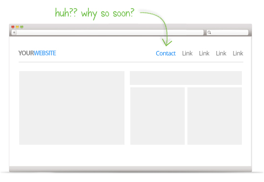
1. You say “Get in touch” instead of “Contact us”
When Steve Jobs said “Be Different”, he didn’t mean in your main menu. So be clear not clever in your main menu. Using phrases like “Get in Touch, “Let’s Chat”, or “Let’s Talk” is confusing. Many of your visitors are consciously or subconsciously looking for the good old “Contact” button. Don’t make it difficult to contact you simply because you want to be clever.
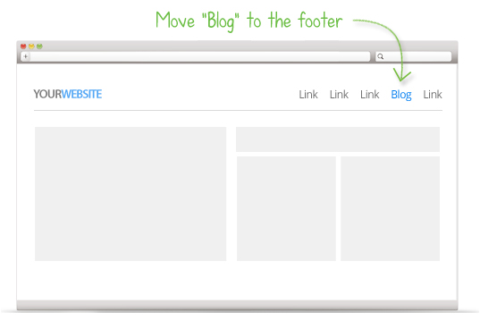
2. A link to your blog is in your main menu
Your blog is a way for people to find your website. It’s not a destination once people get there. So, take it out of your main menu, unless your blog is a main part of the service you provide, or unless of course, your website is your blog. Place it in the footer so people can find it if they need it. But chances are, they won’t be looking for it.
[att_highlight color=”red”]How to Convert 30% of Visitors into SEO Leads: Landing Page Science[/att_highlight]
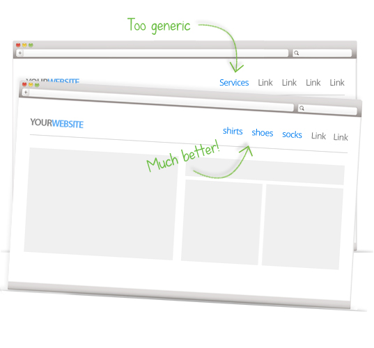
3. You say “Services” instead of listing those actual services
Remember, your main menu helps visitors understand your website. If possible, list your services in the main menu, instead of using a generic word like “services”. I realize this only works if you have a limited amount of services. But if you do this, it works like a charm. On one hand it informs people about what you do, and on the other hand, it gets them one step closer to your services.
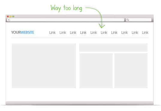
4. Your main menu is way too long
Hick’s Law says that the more choices you give someone, the longer it will take them to make a decision. So help your visitors make a decision by keeping your main menu short, and therefore simple to understand.
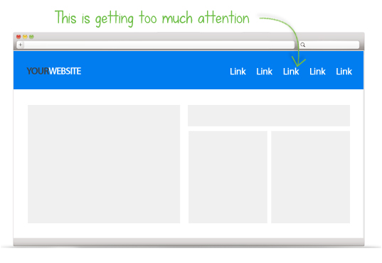
5. Your main menu draws too much attention
Your content should be your super star, not your menu. Many websites have these massive headers with giant menus that draw the eye toward the top of your site, and away from your super star content. Keep the main menu and the header simple and small. Don’t make it loud and obnoxious.
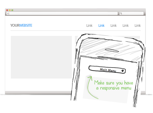
6. Your main menu is not responsive
Have you ever tried using a main menu on a cell phone that was not responsive? Frustrating! You have to zoom in and out and try your hardest not to click on the other menu options next to the button you’re trying to click. Responsive is the industry standard and typically converts your main menu into a drop down that is easy for mobile users.
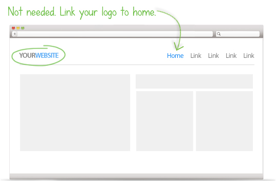
7. Your main menu still has a “Home” button
For years the industry standard has been to not include a “home” button in your main menu. The logo should be the link back to your main menu. Placing a “home” link in your main menu wastes space and draws attention away from your important content.
I have read in the past year that the home button is making a comeback, and some people are arguing that it should go in the main menu. I’m not convinced. So for now, keep in out of the main menu.
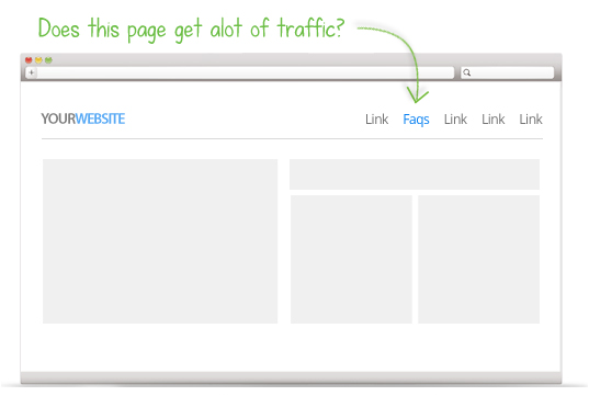
8. You have pages with low traffic in your main menu
Stop cluttering up your main menu with useless pages like FAQ’s. Go through your analytics and see which pages in your main menu are most important. If some of those pages never or hardly get clicked then move them to the footer. Don’t forget Hick’s Law in #4.
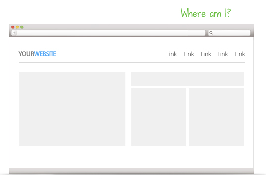
9. You’re not using active states in your main menu
A simple way to make your website more usable is to remind your visitors of where they are at at all times. Of course you can do this with breadcrumbs, but it’s also important to make sure your main menu uses active states. In other words, your main menu should highlight or dim the pages your are on at the moment. This lets the user know where they are at all times on your website.
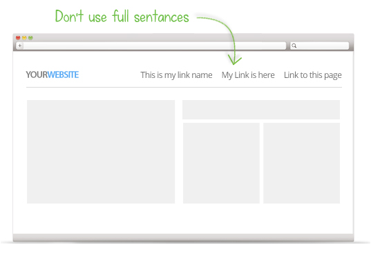
10. Your main menu text links are too long
Your main menu links should not be sentences. At most, keep them to three words or less, but preferably 1-2 words. Surprisingly, many clients ask for this, and I find myself talking them off that dangerous ledge as quickly as possible. Some of the more acceptable longer menu links are: “What we do”, “Who we are”, and “How it works”.
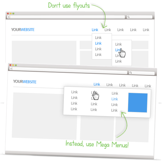
11. You’re using fly-out menus instead of mega menus
Don’t you love the phrase “Mega Menu”! It sounds like an 80’s cartoon. But that’s not the only reason you should love it. They are far more useful than those tricky fly-outs that show menu after menu when you roll over them. Mega menus show on large drop down with all sub menus in that category. Consumers Digest has a great example of mega menus.
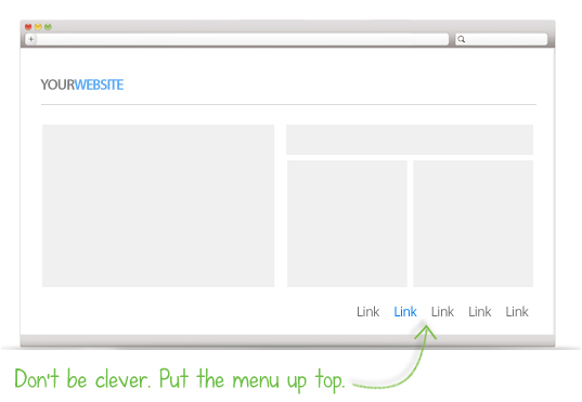
12. Your menu is not in the standard location
OK designers, this one is for you. You are so guilty of this. Don’t try to blame your clients. Admit it. Sometime you get bored with the same old designs and you want to switch things up. Well, don’t put the menu on the bottom of the page. Keep it up top where everyone knows to find it. What if I tried to sell you a car with the steering wheel in the back seat? Again, be clear, not clever.
[att_highlight color=”red”]How to Convert 30% of Visitors into SEO Leads: Landing Page Science[/att_highlight]
13. You’re getting the order wrong
Again, study your analytics so you know what your most important pages are. Stop putting pages that don’t get that much traffic in the first position on your main menu.
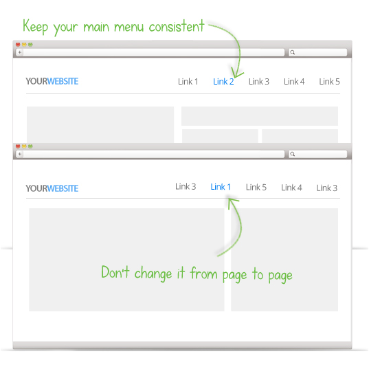
14. Your main menu changes on different pages
Unfortunately this still happens. It’s one of the oldest main menu mistakes I’ve seen for years. Never change the main menu on different pages of your website. it should be the same on every single page. Consistency is usability. Double check your main menu and make sure you’re not making this mistake.
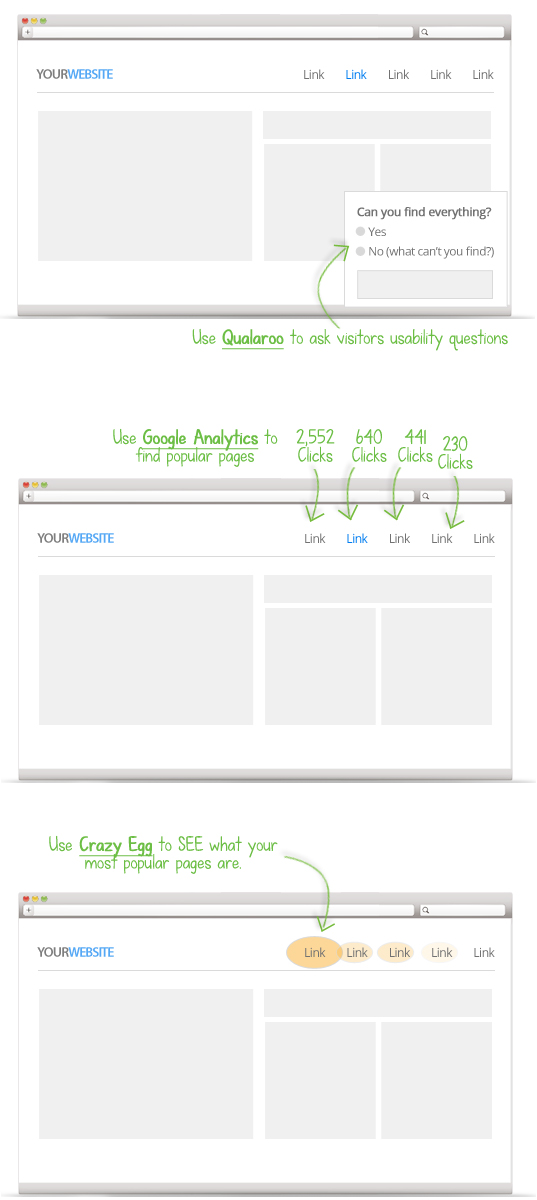
15. You’re not using analytics to help perfect your main menu
Don’t just do what your competition does or what your web designer tells you to do. Test it out and make strategic adjustments. There are three tools you should be using to help determine your menu navigation. Google Analytics, Qualaroo, and Crazy Egg.
- Google Analytics will give you quantitative insight into what pages should be listed in your main menu.
- Qualaro will allow you to ask your visitors what menu items should be in the main menu.
- Crazy Egg will allow you to visually see what pages belong in the main menu.
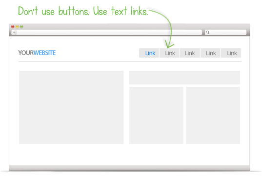
16. You’re using buttons instead of text links
Using text links has two HUGE benefits. First of all, you can easily update those links in your CMS without a web developer. Second, Google can read text, but they can’t read buttons. Google uses the links to your pages as indications of what that page is about. This directly affects your rankings in search engines. Of course you can put alt tags on buttons, but speaking as an SEO expert, I would highly recommend you use text links instead.
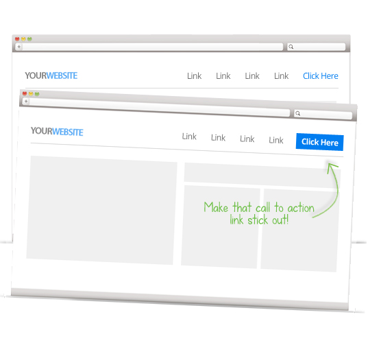
17. You don’t have a call to action button in your main menu
Every website has a goal. Make sure you have a button that stands out from the rest of your main menu items. This button should help your visitor achieve your goal. It could be a simple “contact” button, “free trial” button, or “sign up” button. Make it easy on your visitors so they can help you achieve your goals.
Conclusion
Don’t make it difficult for your users to find your content. Make it easy with simple navigation. Not only will this lead to a lower bounce rate, longer length of time on site, and higher search engine rankings, but it will also boost leads and sales from your site.
[att_highlight color=”red”]How to Convert 30% of Visitors into SEO Leads: Landing Page Science[/att_highlight]
