
- Backlinks Explained: Why Your Backlinks Aren’t Paying Off - April 10, 2024
- Boost Your Agency’s Credibility: A Guide to Online Reputation - April 10, 2024
- URL Slugs for SEO: A Comprehensive Guide - April 10, 2024
Let’s say you’re in the market to buy a brand new car. So, on Saturday morning you decide to head down to local dealership to start test driving a few new models. As you walk onto the dealership’s lot you’re instantly greeted by an overly zealous salesman who shows you the newest and hottest vehicle on the lot. It’s brand new and it has zero miles, so you decide to give that bad boy a test drive. So, you jump in the front seat, but then you freeze for a moment with a perplexed look on your face because you can’t find the steering wheel. You start to look around the cabin of the car, and to your amazement, the steering wheel is in the back seat. WTF? The salesman explains that this is a new and cool way of driving, and that it’s kind of like piloting a biplane from the backseat. Again, you’re like, “WTF man? Get me out of here and show me a normal car.”
Does this sound pretty stupid? Well, it’s not anymore more stupid than going to a website with a “hidden” main menu that some “creative genius” decided would look cooler at the bottom of the page, or hidden behind a tiny menu tab. It’s not any more stupid than a business emphasizing form over function on their website; and it’s not any more stupid than the ten horrible home page mistakes below.
According to Internet Live Stats, there are about 1 billion websites, and according to the International Telecommunication Union, there are about 3.2 billion internet users on earth. As web designers and developers, we should understand that continuity in web design is extremely important, and that starts with the home page. Drivers don’t have the time or patience to learn how to drive every new car they get into. They need to be able to just get in and go. The same goes for people on the web. Users don’t have the time or patience learn a new user experience every time they visit a new website.
As digital marketers, we cannot continue to build websites where form is emphasized before function. There needs to be some consistency for the sake of user experience and the success of a website. On the web, Form Should Always Follow Function, unless you enjoy high bounce rates, low rankings, and a poor user experience.
On most websites the home page is often the most visited page. Other landing pages may collectively get more views and traffic. But the home page, when compared to all other individual landing pages on a site, often has the most views. In this post, I’m going to discuss and show you 10 horrible home page mistakes that result in poor user experiences, which in turn will lead to poor rankings in search engines.
Let’s begin:
1. Ignoring Hicks Law
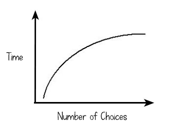 Too many options is not a good thing. It just creates more confusion. Trying to communicate every message to every person who might visit your website is a slap in the face to your core audience. Don’t sacrifice properly communicating to 90% of your target market so you can satisfy the other 10%.
Hick’s Law basically states that too many options increases the amount of time needed to make a decision. You don’t want users processing 20 different messages and graphics on your client’s home page. You want them processing one or two. Having less options decreases the time it takes the average human brain to process the content on a home page, which will lead to lower bounce rates and higher page views.
[att_highlight color=”blue”]How Hick’s Law Helped MySiteAuditor Increase Conversions by 25%[/att_highlight]
2. Using a Slider or Carousel
Sliders are for website owners, not for website users. When I ran The Ocean Agency for 10 years, we were constantly asked to add sliders to the home page of our client’s site. Why? So they could communicate more message, more messages, more messages! Not only does this break Hick’s Law (above) but it’s been tested and proven not to work.
Jacob Nielson of Nielson Norman Group did a study on the effectiveness of sliders. He concluded that, “Accordions and carousels should show a new panel only when users ask for it.” The study also reviewed six usability problems with accordions or moving carousels.
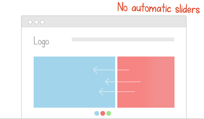
- Users are often frustrated with sliders that move too fast before they can click.
- Some users read slower than others and can’t read all the information before the slider changes.
- International users tend to read slower because of the language barrier. Therefore sliders often change too quickly.
- Displaying one item at a time reduces the chance of a user seeing it.
- Overall, sliders and carousels are just annoying.
- Some users may think it’s an advertisement and just ignore it all together.
[att_highlight color=”blue”]Auto-Forwarding Carousels and Accordions Annoy Users and Reduce Visibility[/att_highlight]
[att_highlight color=”blue”]Don’t Use Automatic Image Sliders or Carousels, Ignore the Fad[/att_highlight]
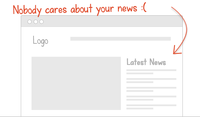
3. Having a News Feed
Unless you’re building Yahoo.com, no one cares about news feeds on home pages. Sure, you or your web design client might care about “Danny Willerman’s” big promotion in their accounting department, but visitors don’t care. Take that silly news feed off the home page. Admit it, you only put it there because you saw other websites do it, and your trying to take up space. News flash, white space is good! News feeds just confuse visitors with more messages, and take away form the main message.
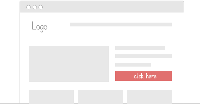
4. CTA is MIA
You did it. People are visiting your client’s website, and most of them are landing on the home page! Oh shit; now what? What’s the main thing you want visitors to do on the website. Unless the answer to that question is “leave” or “bounce”, I suggest you add a call-to-action. A call-to-action should be the biggest button on the home page, above the fold. It can even be a simple sign up form.
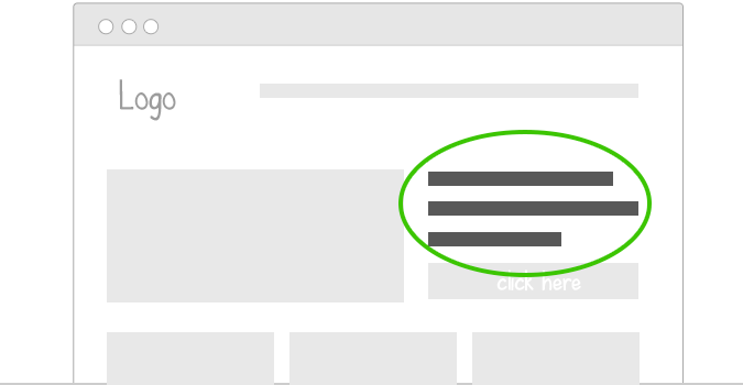
5. A Missing Mantra
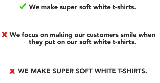
The manta or value proposition on a home page should be the h1 tag, and therefore, the biggest font on the page. A study by the American Press Institute found that the longer sentence, the less humans understood it. Furthermore, the study concluded that a sentence with eight words or less was 100% understood by their readers. In addition, never use all caps in a home page’s mantra statement. This article by UX Movement shows how humans read better if there is more shape contrast and color contrast. Using all caps reduces the shapes of letters to blocks, therefore making it harder to read and understand. See for yourself. Practice reading the below three mantra statements.
Some really awesome home page mantras:
- Simple Help Desk Software. (Groove)
- Work together the easy way. (Basecamp)
- Connect with friends and the world around you on Facebook.
- See what’s happening right now. (Twitter)
- Discover items you can’t find anywhere else. (Etsy)
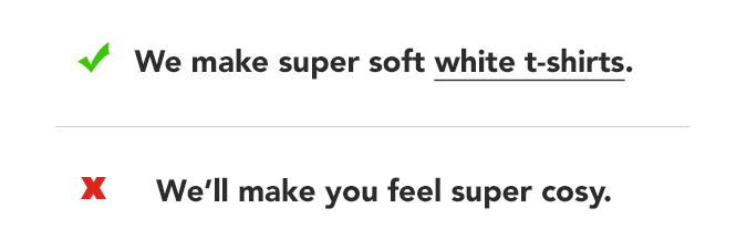
6. The Manta is Missing a Target Keyword
If you doing a big SEO or PPC campaign, then people are going to find your website right after they enter a keyword into a search engine. If it can naturally fit, I would recommend adding a target keyword to the home page’s mantra so users make the instant connection because they just searched that same keyword. Adding a target keyword will also help search engines better understand who the target market is; therefore, helping your rankings, traffic, leads, and sale.
7. No Preferred Domain
A home page can accidentally have duplicate pages, without the developer or website owner even knowing. This is horrible for SEO. Here’s an example of how this can happen. YourDomain.com/index.php and YourDomain.com are actually different pages with the exact same content. Users would never see this, but in the eyes of major search engines, these are different and duplicate pages. Test it out. Instead, YourDomain.com/index.php should redirect to YourDomain.com. If it doesn’t, you need to set up a preferred redirect.
The same goes for YourDomain.com/index.html, YourDomain.com/welcome.html and YourDomain.aspx. They all should redirect to YourDomain.com.
[att_highlight color=”blue”]How to Set Your Preferred Domain and Double the Power of Your Backlinks [/att_highlight]
8. The Logo is not Optimized
I’ve personally analyzed thousands of web pages and 99% of them name their logo file something like “logo.png” or “logo.jpg”. Hardly anyone optimizes their logo for SEO. This is where you can get a leg up on the competition.
- Optimize the logo’s file name for the home page’s target keyword
- Add an ALT tag and title element
- Link back to your home page
[att_highlight color=”blue”]Logo Optimization: A Local SEO Stealth Tactic [/att_highlight]
9. No Giant Image
In this article from Conversion XL, Peep Laja explains how important it is to use “high quality, large images”. In a different post on ConversionXL, Laja also explains the importance of “Designing Your Website Flow To Meet Your Conversion Needs“. Laja explains that you can do by pointing arrows to the CTA, or by having the person in your featured image look at the CTA.
Jacon Nielson of Nielson Norman Group, says, “A call center ad with a model in it on the phone may be a good picture technically, but it will more likely be ignored“.
Giant Image Take aways:
- Use large high-quality images
- Place them on the left side of the home page
- Don’t use beautiful people or stock photos. Use normal looking people.
- Have the subject look at the CTA, or point arrows at the CTA.
10. It’s Not Optimized for Local
It’s official! In 2014 internet access through mobile phones officially surpassed internet access via desktop computers. In addition, a study by comScore, Neustar Localeze, 15 Miles found that 78% of local-mobile searches resulted in an offline sale. The study also found that the top reason for a local search was “to find a specific business”. This means that if a local business’ home page is not optimized for local SEO, they’re going to have a some super frustrated customers.
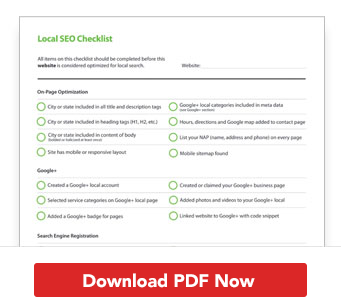
- NAP
If the website is for a local business, then make sure the Name Address and Phone number appear right at the top of your home page for mobile users. We don’t have time to navigate your site. We’re on the go and we need to find you! - Hours
Make sure your hours are easily visible as well. - City and State
Make sure your home page is optimized for keywords that use your city and state. For example, don’t target: “Organic pet store”. Instead target “Chicago organic pet store”.
Final thoughts
Your home page can be your client’s best friend or their worst enemy. Agencies, you have no excuses. You need to follow these best practices for your customers. Remember, form should always follow function on the web. Emphasize user experience on your client’s home pages over design. You don’t need to reinvent the wheel each time you design a new home page because according to Pablo Picasso, “Good artists copy, great artists steal.”