- Backlinks Explained: Why Your Backlinks Aren’t Paying Off - April 10, 2024
- Boost Your Agency’s Credibility: A Guide to Online Reputation - April 10, 2024
- URL Slugs for SEO: A Comprehensive Guide - April 10, 2024
This is the story of how we successfully applied “Hick’s Law” to MySiteAuditor and increased conversions by more than 25%. The reason I’m so excited to share this case study with you is it had such huge impact on our site, and it can be applied to almost any type of conversion form, whether it’s a simple free trial form, contact form, or free website analysis tool. So, use this case study to think about how you can apply Hick’s Law to your website or digital marketing strategy.
What is Hick’s Law?
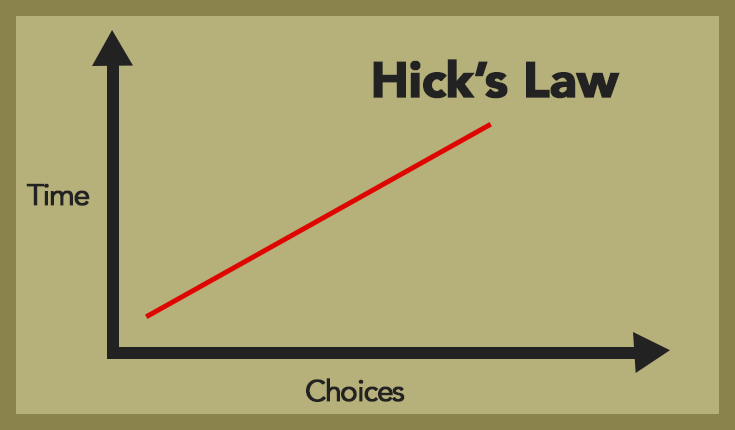
Hick’s Law identifies the amount of time it takes a person to make a decision when presented with more options or fewer options. The law states that increasing the amount of choices in any decision will increase the amount of time needed to make a decision. In digital terms, this means that the fewer choices you give a user, the faster and more likely the user is to make a decision.
Applying Hick’s Law to MySiteAuditor
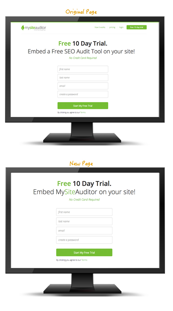
We decided to test Hick’s Law on our free 10 day trial sign up page to see if we could increase the amount of free trial sign-ups. We used optimizely.com to do the A/B testing. Our theory was that if we decreased the amount of decisions a user had to make on our free trial page we would see an increase in free trials. So, we removed the header, including the main menu and the logo, as well as all other content on the page. This left one option for the user: the free trial form.
The Results
We tested this for 45 days by showing half the users that visited the free trial page the original page and the other half the new page. The new page received on average 25% more conversions, and for one week it got 36% more conversions.
On the original page the user saw 6 options (possible links to click) plus an additional 7 options (possible links to click) in the footer. So, on the original page, the user had 13 total options (possible links to click) on the page . By taking away 12 options and leaving only one option (the free trial form) we increased conversion by over 25%.
Other Successful Sites Using Hick’s Law
Groovehq
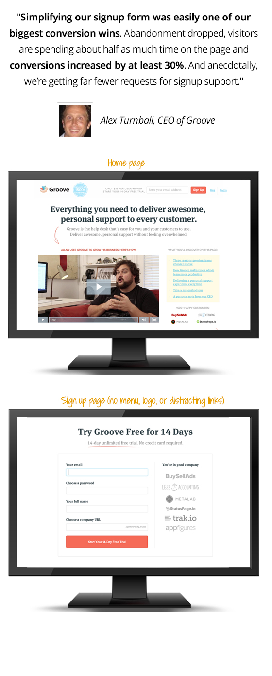
Groovehq.com is one of my favorite websites on the planet. It’s so simple and so clear. The first time I accidentally stumbled upon it I signed right up for their support software and ditched my previous support software, who shall remain nameless.
The brilliance of Groove’s site is that they have very few menu options, and when you get to the sign up page there is only one option, SIGN UP! I recently spoke with the CEO of Groove, Alex Turnbull, and here’s what he said about their awesome and simple free trial page.
Less Accounting
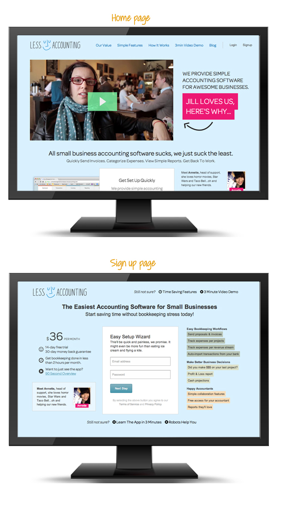
I fell in love with Less Accounting almost 2 years ago. I think it was their awesome tag line, “All small business accounting software sucks, we just suck the least.” I also couldn’t help but notice how simple their sign up page was. Again, they removed all the distracting main menu options and only left the most important ones.
How you can apply Hick’s Law
Every single website should utilize the eye-opening strategy of Hick’s Law. First define your conversion goal for the page and determine all other clickable options the user has besides your conversion goal. Please don’t think you have get rid of all other options, but you can and should try to minimize the amount of options the user has by reducing the unnecessary options. Either way you could see a dramatic increase in conversions like we did. However, I do recommend A/B testing everything before you make the decision. What’s right for some sites may not be right for yours.
Other places to use Hick’s Law:
- Sign up pages
- Contact pages
- Main menus
- Checkout pages
- Free trial pages
- Email newsletter sign up forms
- Free tool pages
Conclusion
Don’t run back to your web developer and plead with him or her that you must remove all menu options and links from your pages. But do tell them that you want to start A/B testing immediately to see if you can make the decision process a little easier for your website’s visitors. Try optimizely.com to do your A/B testing and tell me below if Hick’s Law worked for you.


