- Backlinks Explained: Why Your Backlinks Aren’t Paying Off - April 10, 2024
- Boost Your Agency’s Credibility: A Guide to Online Reputation - April 10, 2024
- URL Slugs for SEO: A Comprehensive Guide - April 10, 2024
The most important website trend in 2014 is transparency. If you have a website today transparency can really make or break your success. Transparency affects traffic, conversions, and sales. I’ve run The Ocean Agency for the last 10 years, and the one thing I find myself encouraging our clients to do more and more often is be more transparent. But it’s not easy; our clients need our help. So, in addition to listing the reasons why it’s so important be transparent on your website, I’ve also listed a number of ways to be more transparent.
Why is being transparent on your website so important?
The simple answer is trust. There is so much spam online, and so many people running scams that people often have to rely on their gut or natural instincts when making a safe purchase decision online. So help yourself by helping your visitors feel safe.
- Transparency makes your visitors feel safe
- People buy from people
- There is so much spam online
- Improves rankings (higher engagement, lowers bounce rates, improves length of time on site)
- Increases conversions
- Increase sales
How to be more transparent
- Add a company page (I know…duh!)
- Add images to your company page (let your visitors see you)
- Add team video. Let your visitors see and hear you and your team
- Photos or video of your office. Let your visitors see where you work and what your offices look like.
- Don’t hide your phone number. This is a huge red flag.
- Integrate your social media accounts
- Show customer reviews and testimonials
- Embed a Google map of your office
- Show a photo and the name of your sales person on the sales or contact page
- Don’t use stock photos of people in offices. Instead take real photos of your people in your offices.
- If you sell services, then describe your process
- If you sell products, then show how they get made
Proof of transparency power
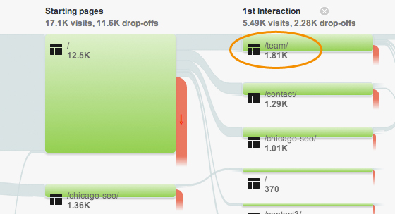
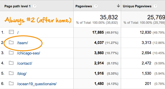
For years we thought our portfolio page was the most important page on our site. Well, we were wrong. As you can see, our visitors are more interested in who will be performing the work they see in our portfolio.
Our top pages visited in 2013
Interaction flow chart

Conclusion
It’s real simple folks. If your website has a 1% conversion rate, then the easiest way to double your sales is to get your conversion rate to 2%. Being more transparent on your website may be that tipping point that increases your conversion rates by double, triple or even quadruple. Always remember, people buy from people. Be transparent.

