
- Backlinks Explained: Why Your Backlinks Aren’t Paying Off - April 10, 2024
- Boost Your Agency’s Credibility: A Guide to Online Reputation - April 10, 2024
- URL Slugs for SEO: A Comprehensive Guide - April 10, 2024
You are wasting your time writing content no one will read. As obvious as my advice sounds, people continue to stuff web pages with text. There’s this fear that we might leave something out someone needs. And using big words makes us look intelligent, right? Not so much. You will not impress your visitors with long paragraphs or big words. More often than not you will confuse and deter.
The Facts – Studies show, most visitors aren’t reading all your content
Study #1
In 2008 (yes a little dated but still very relevant and supported by other studies), Jakob Neilsen identified that on the average web page, users have time to read at most 28% of the words during an average visit. The following chart shows the maximum amount of text users could read during an average visit based on this finding.
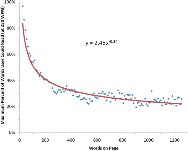
Lesson learned – Visitors just don’t have time to read all the content on the page.
Study #2
In an eye tracking study by the Missouri University of Science and Technology department, participants spent only 5.59 seconds focusing on the site’s written content before moving on.
Lesson learned – You better get straight to the point because visitors will move onto other stimuli on the page.
Study #3
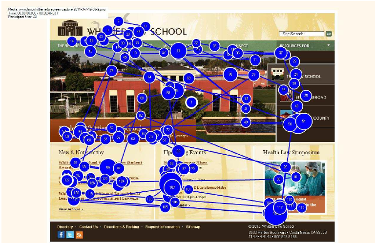
In 2009, Google performed an eye tracking experiment on a search results page. Although this isn’t exactly the same as viewing a web page, it is indicative of how people scan information on the web.
Notice that the viewers’ eyes do not follow a linear progression from left to right. The user’s eyes jump around the page, scanning content.
Lesson learned – Visitors are looking for elements that draw their eyes and are easy to digest – images, bolded words, lists, etc.
The Strategy – What you should do instead of writing a novel
Hopefully you’re convinced that people are just not reading all your content. So how do you effectively communicate all your information in half the space? Approach this challenge considering the two following elements:
√ What you’re saying
√ How you’re formatting it
What you’re saying
Just cut to the chase! When I get to your site I need you to answer 3 questions:
√ Am I in the right place? – Let the user know in a large heading what the topic of the page is about. Generally this will be your H1 and should consist of just a few words.
Used Dodge Pick Up Trucks For Sale
√ What are the benefits of your offering? – Communicate what you can do for me right away.
We offer used dodge pick-up trucks at each one of our 10 Chicagoland locations. Our trucks include:
√ 20,000-85,000 miles
√ Automatic and Manual Drive
√ 2 and 4 door options
√ CarFax Reports available upon request
√ What are my next steps? – Tell me what I should do next. Should I send an email, call your office, purchase via your website? Make it very clear what you want my next step to be.
Call or Email Dave, your personal sales associate for more information regarding our pick up trucks.
√ Phone:123-456-7890
√ Email: [email protected]
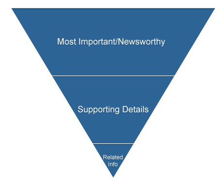
If you need something visual to help you remember the flow of information use this inverted pyramid below.
How You’re Formatting It
Use large headings
Make sure you’re effectively using heading tags to communicate main ideas and organize content.
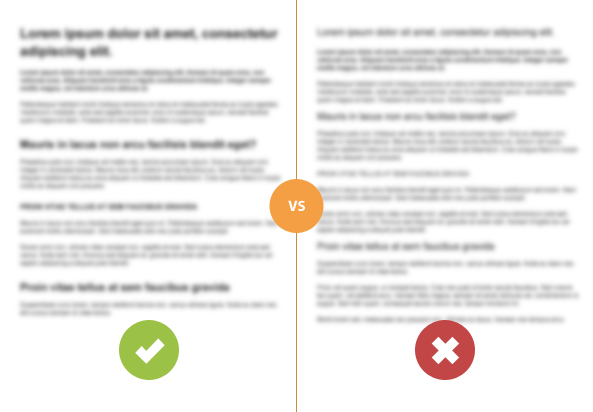
Below is an example from Rafal Tomal which reveals why headings are important in content. Even when blurred, the content on the left looks more organized because of the large headings. Which would you rather read?
Use large font and increased line height
Nothing is more annoying than getting to a site with tons of content in 9pt font. Who can even read that? Although studies do show that smaller font forces people to read each word in a string of text, it has been shown to decrease comprehension. Because of this, sites have been trending towards larger fonts – 13 and 14pt for body copy.
There is a strategic ratio for font size and line height (the space between two lines of text). Smashing Magazine analyzed typographic design patterns common to modern web design. Here are some of their findings:
√ Heading to body font-size ratio
√ Head font size / Body copy font size = 1.96 (roughly x2)
√ Optimal Line Height for Body Copy
√ Line height (pixels) / body copy font size (pixels) = 1.48 (roughly 1.5x)
√ Space between paragraphs (pixels) / line height (pixels) = .754 (roughly .75x)
Don’t be scared of white space
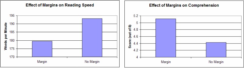
Site owners are often concerned about the amount of white space on a page. They misinterpret it to mean “We don’t have enough content to fill the space. We’ll look inept.” On the contrary, what space is not just good, it’s great. It actually helps visitors with comprehension. In a study performed by the psychology department of Wichita State University, they compared reading performance with four white space layouts. Variables included:
√ Margins surrounding text
√ Margins surround leading
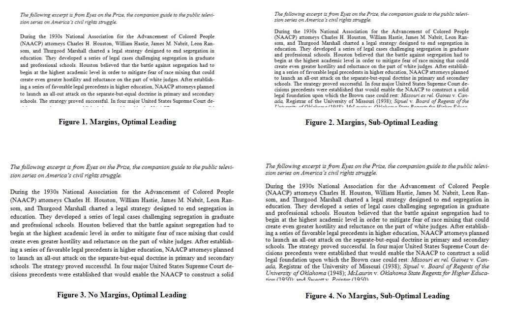
Here were the results. Although reading speed increased when margins were smaller, reading comprehension decreased significantly.
Use bullets and lists when applicable
This one seems like a given but it’s definitely not utilized enough. Most types of information can be easily turned into a list. People generally read in an F-shaped pattern on the web, so lists are ideal to quickly and effectively digest information. Another study by Jakob Nielsen (although a little outdated) measured the effect of what they called “Improved Web Writing.” There was a 124% increase in usability when the participants were presented with concise, scannable, and objective language content. Usability factors that improved:
√ Task Time
√ Errors (questions on content)
√ Memory
√ Time to recall site structure
√ Subjective satisfaction
Control:
Improved Version:
Now, wouldn’t you want your visitors to be more subjectively satisfied?
But Wait!
I know what you’re going to say.
“Practice what you preach! This was a long blog article!”
Ahh, you see, blog posts are a whole different beast – as are white papers and other resources that are supposed to supply the reader with a lot of detailed information. But, just because you have more information to share, doesn’t mean that you can’t format it effectively.
Conclusion:
So my message is simple – get to the point! Don’t overwhelm your visitors with tons of information they won’t even read.
Do you know of any sites that do this well? Share examples with us and let us know what you think they’re doing right. Here are a few of our favorites:
http://copyblogger.com/
http://prezi.com/
http://conversionxl.com/