- Backlinks Explained: Why Your Backlinks Aren’t Paying Off - April 10, 2024
- Boost Your Agency’s Credibility: A Guide to Online Reputation - April 10, 2024
- URL Slugs for SEO: A Comprehensive Guide - April 10, 2024
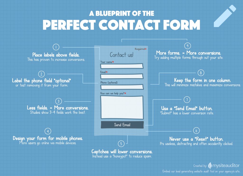
According to a study by Formstack in 2015, contact forms only have about a 1% conversion rate when the form has 4 fields. In other words, if you have 1,000 people visit your contact page, only 10 of those visitors, on average, will complete your contact form. So, how can you increase that conversion rate? How can you raise that percent up a few points so you can convert 20-30 visitors out of 100? Well, I’ve done some research. I searched for data, case studies, and statistics, and I’ve compiled everything together and came up with a blueprint infographic of the perfect contact form.
Just so we are all on the same page, I’m talking about the contact form on your contact page. Let’s not get crazy and discuss every possible type of contact form, in every type of industry, on every type of website. This infographic only focuses on companies who provide some type of service, and are looking to generate as many quality leads as possible from their contact form.
Share this Image On Your Site
1. Place Labels Above Fields
Placing labels above fields makes it easier for users to see what they should enter into the respective fields. Whereas, labels inside of fields leave more room for errors because the label disappears when you start typing. In addition to more errors, it’s hard for users to fix those errors, because they have to delete the content of each field to see the label again.
Not only should you keep your labels above your fields, but also make sure you follow the law of proximity and keep the label close to the corresponding field. Labels that are too close to the previous or above field leave too much room for mistakes and errors, and that leads to low conversion rates.
2. Label the Phone Field “Optional”
A person’s phone is a very private thing these days. After all they are filling out a contact form so they don’t have to talk to you. If you must ask for a phone number make it optional, and clearly label the field “optional”, right next to the phone label. One company’s conversion rate went from 42% to 80% by making a phone field optional on their contact form. That’s almost double the conversions!
3. Less Fields = More Conversions
The speed at which people move on the internet has made us all impatient. It’s no wonder that a large number of fields tend to intimidate and cause overwhelming anxiety for users. Do you really need my zip code? Do you really need my address? Do you really need my phone number? Remember your contact form has one job, and that’s to get your foot in the door, not to close the deal.
Figure that every field you add will lower your conversion rate. In fact, Neil Patel once reported that Expedia saw a 12 million dollar profit from eliminating one field from their contact form.
4. Design Your Form for Mobile Conversions
2014 became the first year that the internet was accessed more times from mobile devices over desktop computers. In 2015, Google released a mobile-friendly update to their search algorithm that ranked mobile-friendly pages higher in mobile search results. In other words, make sure your contact form is mobile-friendly so mobile users can find it in search engines and and easily use it on mobile devices.
5. Captchas Will Lower Conversions
Captchas are getting worse and worse because spam bots are getting smarter and smarter. You can barely read captchas these days. Contact forms are abandoned all the time because they won’t submit due to a complicated captcha. It’s horrible. Instead, try using a honeypot. A honeypot is a hidden field that users can’t see. However, if a spam bot fills out your contact form they’ll be rejected because they filled out the invisible field (honeypot). Honeypots are great because they reduce spam and don’t hurt conversions.
6. Never Use a Reset Button
Oh my goodness, I hope you don’t have a silly “reset” button at the bottom of your form. What an awful idea. Why on earth would anyone want to click this button after typing all that information in. Well, nobody does, but users do accidentally hit that button all the time. Again, internet users are impatient and we just get click-happy sometimes. Remove that useless “reset” button and never use it again.
7. Use a “Send Email” Button
“Submit” is such a terrible word. It sounds technical by itself. That’s probably why it has a low conversion rate. Instead of just saying “Submit” try “Submit Form” or my favorite, “Send Email”.
8. Keep the Form in One Column
Putting your contact form in two separate columns increases the possibility of a user missing fields and getting errors. Users often miss fields right in front of their face because they are in a second column. The simple reason behind this is that people are just used to filling out and going down one column. Why change things?
9. More Forms = More Conversions
My former agency did a study a couple years ago and found that on average, 7 out of 15 (46%) of contact form submissions came from contact forms located on pages other than their contact page. So, more contact forms throughout your site means more conversions. Keep in mind, not everyone will find or go to your contact page, especially if your site is 100s or 1,000s of pages.
In Conclusion
The “perfect” contact form really is subjective. What works for your site may not work for mine. However, some of these statistics don’t lie. They’ve been tested and tested again. But there are so many other things to consider like color, position of the form, the other content on the page, the industry and much more. So, what’s my conclusion. Start with this blueprint, and tweak during AB testing. Once you’ve tested and found which form works best for you then and only then will you have a blueprint for the perfect contact form. Good luck.
Sources:
http://www.quicksprout.com/2013/01/31/how-to-optimize-contact-forms-for-conversions/
http://blog.hubspot.com/blog/tabid/6307/bid/6748/3-Form-Fields-That-Kill-Landing-Page-Conversion-Rates.aspx
https://mysiteauditor.com/blog/5-reasons-your-visitors-dont-fill-out-your-contact-form/
http://www.sitepoint.com/definitive-guide-form-label-positioning/
https://www.formstack.com/report/form-conversion-2015

