- Backlinks Explained: Why Your Backlinks Aren’t Paying Off - April 10, 2024
- Boost Your Agency’s Credibility: A Guide to Online Reputation - April 10, 2024
- URL Slugs for SEO: A Comprehensive Guide - April 10, 2024
It’s been 10+ years since I built a website for my first client and I’m not ashamed to say that back then I was a terrible web designer. I was terrible for many years and for many different reasons. In fact, everything you’ll see below, I was guilty of. However, I eventually learned how to perfect the web designing process the hard way, through determination, research and lots of experience. Today, I think it’s safe to say I’m a very good web designer. If you don’t believe me, ask Inc Magazine, Crain’s Business, CBS, ABC, and NBC. Because they’ve all asked for my opinion and advice multiple times on this subject.
I constantly see many web designers making the same mistakes I made 10 years ago so I hope this article will help web designers and those who have or are going to hire a web designer. So, if you’re building a new website for your company, here are 20 ways to tell if your web designer is terrible. If you’re a web designer, pay close attention, print this blog post, email it to yourself, or bookmark it as a reference, because here are 20 ways you can tell if you are terrible.
1. The price is under $1,000 bucks
 If your website is costing you less than a $1,000 bucks, then chances are your web designer is terrible and your website will be terrible too. We all wish we could spend $1,000 dollars and make millions, but if it were that easy everyone would do it.
Stop being cheap, because, you get what you pay for. You could easily buy a car for $1,000 bucks but again, you get what you pay for. If you still think your website should be under $1,000 bucks, eventually you will come crawling back to the web designer that was too expensive. Only now you’ll have to pay for a good web designer + the costs of your really cheap web designer.
Common Question:
How much to build a website?
My common answer:
Well, how much does it cost to build a house?
2. The “Headset Hottie”
 A Headset Hottie is a joke amongst digital marketers. It’s a stock photo of an attractive female with a headset on, ready to take your call. This photo can usually be found on your contact page, in a sidebar, or sometimes even in the header. Terrible web designers have been adding images like this to websites for years. A Headset Hottie won’t increase sales or phone calls. It will only make your website look cheap and silly. So be careful, because your website could end up featured on a website like headsethotties.com.
3. No weekly call
Momentum is the energy and excitement that every new website project starts off with. It’s critical to maintain momentum throughout the course of a web design project. The second your web designer loses regular contact is the second you lose the project’s momentum. Your web designer should be in contact with you weekly if not daily, and if they are not, demand it and agree on a meeting time and day each week until the project is complete.
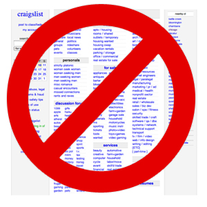
4. You found ’em on Craigslist
 I advertised for business on Craigslist about 6 or 7 years ago when I was still a terrible web designer. From my experience, I learned that Craigslist is where cheap people can find other cheap people. Of course, every rule has it’s exceptions and I do occasionally post on Craigslist’s job board to see what’s out there but very rarely do I get the quality I’m looking for.
So, if you found your web designer on Craigslist you’re probably also breaking rule #1, by being cheap.
…sorry Craig
5. No copywriting solution
Creating content for your new website is the biggest challenge every client faces. It’s also the #1 cause for delays (in my 10 years of experience). A good web designer will be prepared with a solution and warn you about this at the kickoff meeting.
Possible copywriting solutions:
- Client creates all content (be careful this takes time and dedication)
- Client offers an internal resource (a copywriter on their staff)
- Client hires a freelance copywriter
- Web designer offers an internal solution (a copy writer on their staff)
- Web designer offers a freelance copywriter
6. Your web designer’s #1 goal is creativity
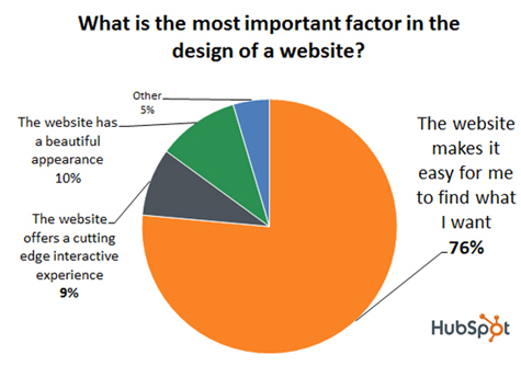
Creativity should not be the #1 goal for your website. In a survey by HubSpot, 76% of users said that the most important factor in the design of a website is that “The website makes it easy for me to find what I want.” Only 10% of users said, “beautiful appearance” was the most important thing to them. Organization of content was their number #1 concern for websites, not creativity. The more organized your content is the longer users will stay. The longer users stay, the more likely they will buy. So, make sure your web designer’s priorities are correct.

7. Your web designer is related to you
 “Never hire anyone you can’t fire.” You should know better than to hire a relative to work for you in the first place, let alone build your website. However, if you do decide to hire a family member to build your website, they will probably give you an “unbelievable” discount. If they’re a pro, that’s great news; however, the bad news is that the project eventually won’t be worth their time, and you will eventually end up on the back burner.
8. Your web designer is YOU!
Peep author at conversionxl.com says, “If you designed your website yourself and you’re not a designer, it sucks”. It takes years of experience to perfect what we do. You can’t learn this trade in a few hours.
Peep, I couldn’t agree more!
9. You built it using a web design tool
Anyone can learn how to use a cheap web design tool in an hour or so but you can’t learn what a good web designer has learned with years of experience. In other words, learning how to use a website builder won’t teach you how to design a web site that will get targeted traffic, conversions, and sales.
In addition, just because you learned how to use Photoshop doesn’t mean you’re a good web designer. I’ve received so many resumes with people who know the Adobe Suite like the back of their hand, but their work sucks. Again, it takes years of experience to not be a terrible web designer.
10. No project management software
 Project management software keeps everything organized and in one central location for everyone to easily find. It assigns tasks, keeps timelines, organizes assets and holds everyone accountable for their responsibilities. I couldn’t imagine a web designer not using project management software. But if this is the case, dump your web designer, because he or she is terrible.
What’s my favorite Project Management software? Basecamp
11. They don’t ask enough questions
Your web designer should ask you lots of questions, especially before they start working on your project. They should ask everything about your 3C’s (Company, Competitors, and Clients). Questions should start during the initial sales meetings and kickoff meeting, and then continue throughout the strategy phase of your project. No questions is a RED FLAG and the sign of a terrible web designer.
10 sample questions:
- What are your primary and secondary goals for your website?
- Who is your target audience?
- Describe your typical client.
- Who are your online and offline competitors?
- Are you doing any marketing offline?
- Where is your target audience (local, national, global)?
- Do you have brand guidelines?
- Do you have a content writer available?
- What kind of assets will you provide? (photo, videos, images, brochures)
- Can we access your current site analytics?
12. They have too many clients
I used to be guilty of this a lot. I had way too many clients and I could not focus properly on any of them. Therefore, they all suffered. I would jump back and forth on different projects, while ignoring others. It was horrible and stressful. Projects were constantly late and clients were not happy.
Solution:
If you’re a web designer and your goal is to make $500,000 this year, focus on getting 10 clients at $50,000 per project, rather that 50 clients at $10,000 per project. This will give you the same revenue, but with less clients, less phone calls, less personalities, and less headaches.
13. No scope of work
A wise man in project management for 20+ years once told me that 80% of the problems that occur during a project occur because of a poor scope of work. A good scope of work details all work to be performed and delivered. It is critical that both parties agree to the scope of work before the project is executed.
14. No architecture strategy
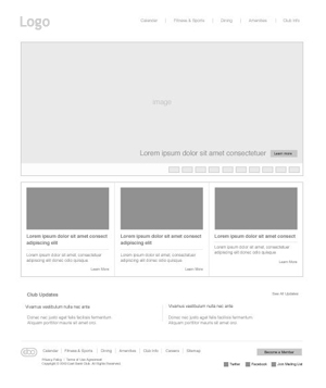
 Let’s say your family decides to build a dream house. Well, before you start actually building this house, you’re probably going to hire an architect to blueprint the house and all the rooms. Custom web design is very similar to building a house. Before designing any pages, your web design team should map out and wireframe (blueprint) each page of your website and get your approval before designing and developing.
15. No conversion strategy
Has your web designer helped you define what your primary and secondary conversions are? A conversion can be a phone call, email sign up, contact form, e-commerce purchase or a button being clicked. Your web designer should help you define what your conversions are.
Primary conversions are actual sales made on the site or inquiries for sales discussions through a contact form. Secondary conversions are typically forms that capture emails. Your web designer should ask how you want to be contacted and how clients typically prefer contacting you. After all, this is why you built your website.
16. They’re in your IT department
I blame clients and web designers for this one. Nothing is more frustrating than someone in IT calling our agency to inquire about a new website. Shouldn’t someone in marketing be calling us? I will never understand why companies associate IT departments with web design. As Ben Hunt of webdesignfromscratch.com “Web design is marketing”, not IT.
Do us all a favor. If you’re in IT and someone in your company asks you to help build the company website, humbly decline and recommend they talk to someone in the marketing department.
17. The handshaking image
 This is a big red flag. If you see this on your site take it down. I’m speaking of course about the infamous hand shake. This is usually a simple picture of two men shaking hands. It’s cheesy, a waste of space and draws wasteful attention.
18. No SEO strategy
Let’s say you wanted to open a new store that required lots of foot traffic. Would you let your real estate agent sell you a very nice storefront without knowing or telling you anything about the neighborhood? Me either. In other words, if your web designer doesn’t do SEO, they are terrible.
19. No CMS
I can’t think of any good reasons why your web developer wouldn’t build your website on a CMS (content management system). Not using a CMS is not going to save you money. In fact, it could be more expensive because a good CMS like WordPress is built on a framework that has prebuilt functionality saving you time and money.
20. They’re in a different country
 I’ve been developing professional websites for about 14 years and I promise that you will need experience to work with web designers and developers in other countries. Yes, they speak english and yes they are cheaper but if you don’t understand how to properly vet designers and developers in other countries you will most likely find a terrible web designer who doesn’t do any of the 19 items above, giving you a very frustrating and infuriating experience.
Conclusion
If you’re a web designer and you firmly disagree with anything I’ve said, there are exceptions to every rule. However, in my experience the above hold true a vast majority of the time. If you hire or fire your web designer by the above set of rules I can safely guarantee your website will be more successful and make you a lot more money.

