
- Backlinks Explained: Why Your Backlinks Aren’t Paying Off - April 10, 2024
- Boost Your Agency’s Credibility: A Guide to Online Reputation - April 10, 2024
- URL Slugs for SEO: A Comprehensive Guide - April 10, 2024
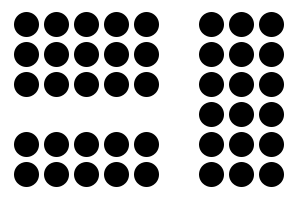
Humans have an innate desire to want to group objects we see in the world together. This makes the information far easier to process and understand. Therefore, when website content is visually grouped for us, it becomes much easier to process and understand. The Law of Proximity (one of Gestalt Laws of Grouping) states that humans perceive objects that are closer together as related objects. The reasoning is that the human brain would rather process fewer sets of objects rather than a much larger number of individual objects. Therefore, abiding by the Law of Proximity on your website will allow your visitors to more easily process and understand your information. This will most certainly leads to a better user experience, more conversions, and more sales.
The Real World Example
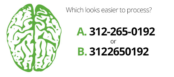
Let’s look at your phone number. Why do we show your phone number in three groups (312-265-0192), rather than one long number (3122650192). The Law of proximity has a lot to do with it. By creating three groups of numbers our brain can process the information much easier than one large group. The same can be said for many other numbers used in your life, such as your social security number or your EIN number.
7 Ways Your Site Breaks The Law of Proximity:
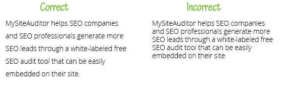
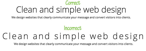
1. Headings
I can’t stand when sub-headings on blog posts are right in the middle of the space above and below the content. It’s so confusing and throws me off every time I see it.
I do a lot of research online, and something I occasionally search for are the best WordPress themes for different industries. The most common search results are blog posts that list the best WordPress themes. Many of these blog posts have the same problems. The subtitle of the theme and the “Free Demo” button is spaced exactly between the above and below content and I end up clicking on the wrong demo all the time. I’d say it happens about 50% of the time.
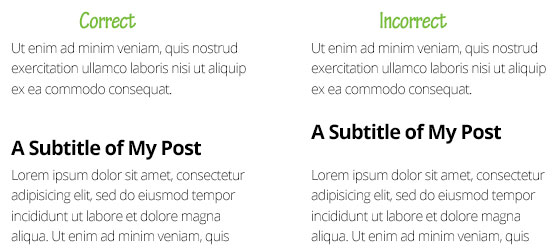
The solution is to add larger top margins on your headings and smaller bottom margins. In fact, your should triple the space on top of your headings compared to the space below them. In other words, if you have 5 pixels of space below your headings, then have 15 pixels of space above them. Problem solved.
2. Line Height
Line-height is the amount of space between each line of text in your content. There is nothing more frustrating than trying to read content online that has too little line-height. According to the Law of Proximity, because your lines of text are so close together it makes it harder for humans to read and process.
The solution is to add more space between the lines of text in the content of your website. You can easily do that in your CSS by adding line-height to all of your text. For all of my body content, I take the font size and add 11 to get the proper line-height. So, if my font size is 14px, my line height would be 25px. That formula only works for body text.
3. Letter Spacing
Must like line-height, letter spacing can make text hard to process and hard to read. Text with to much letter spacing spreads the letters out in words making it more difficult for us humans to process, and therefore, breaks the Law of Proximity.
The solution is to add letter spacing to the text styles in your CSS. I most commonly see this problem in headings that use thin fonts. So, don’t be afraid to add letter spacing of -1px or -2px.
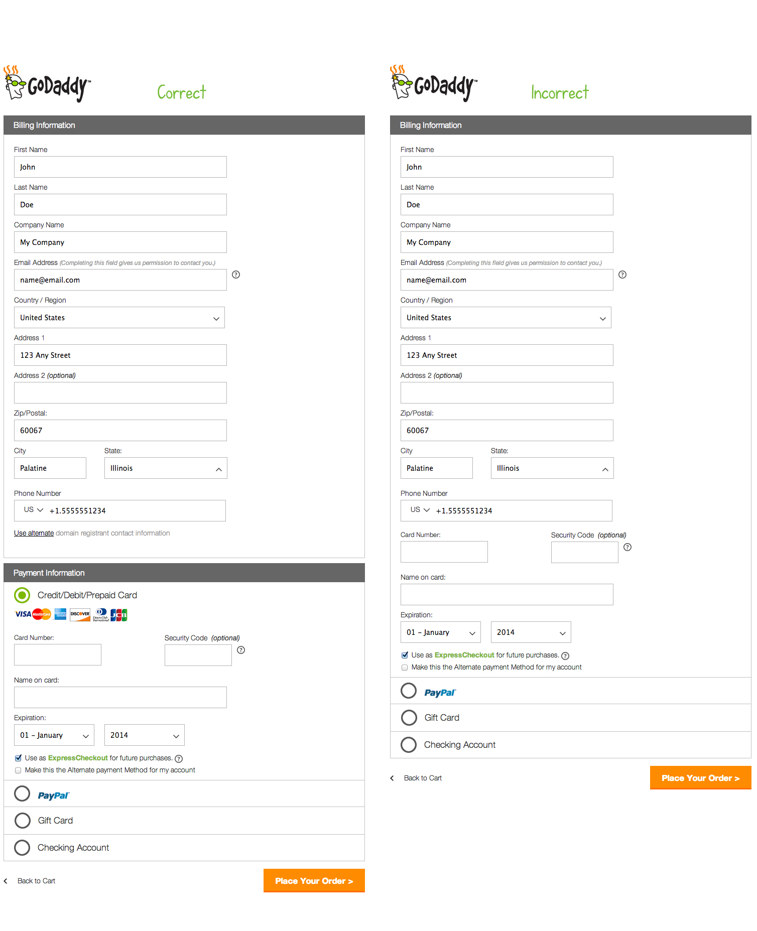
4. E-commerce Forms
The checkout process is becoming a science. With the amount of money lost due to high drop-off rates at checkout, every detail counts. By better grouping things during the checkout process, you make it much easier for you visitors to process the information you are asking of them. This of course will lead to lower drop-off rates and more sales.
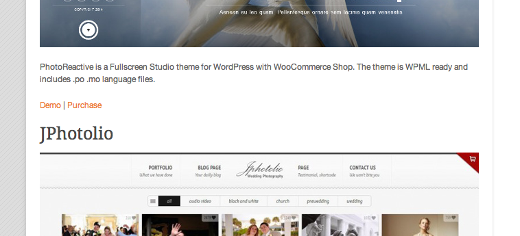
The solution is to group required information together in the checkout process using white spacing and section headers. See below how Godaddy Groups the required checkout information so the process seems easier to the user.
5. Content
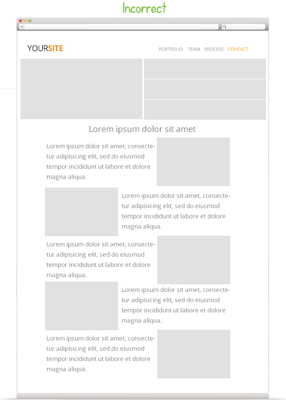
There is nothing worse than seeing a sea of text that goes on and on down the page, while trying to learn more about a company, service or product. Your visitors will see long paragraphs of text as one giant object and skip right over them.
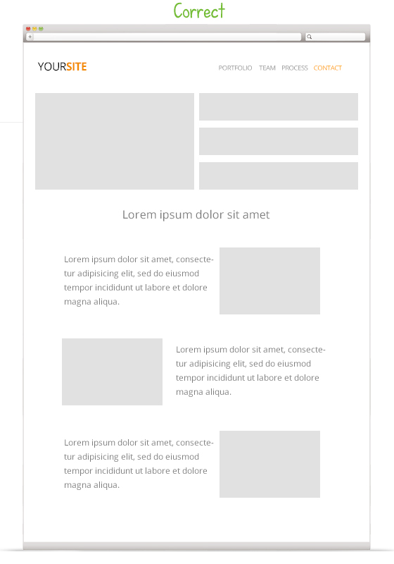
A solution to this is using the zig-zag effect. The zig-zag effect allows your visitors to more easily process and understand the information small groups of information as they scroll down and scan the page.
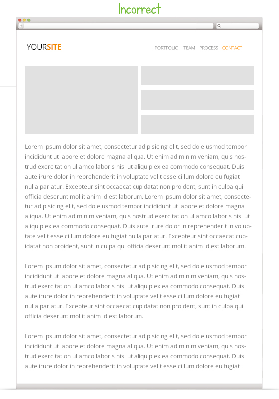
6. Images
According to the laws of visual hierarchy, the images on your site are the first things that your visitors will see. So it’s important to group images closely to their related content, making it easier for visitors to understand and process the image and related content easier.
The solution is to either A.) space related images closer to content, or B.) try to always wrap content around images. See my example below.
7. White space
For some reason, clients and some “web designers” got it in their head that white space is bad. White space is good, very good. It helps separate objects into groups, making it easier for your visitors to process. A common problem I see is too little white space between groups, creating confusion in the eyes of the user.
The solution is to add enough white space where it become apparent that there are two or more groups, rather than one.
Conclusion
Web design is a science. You can’t master it in a week. It takes years of experience to get good at it. But don’t just study web design, study age old marketing principles and see how you can apply them to web design.