- Backlinks Explained: Why Your Backlinks Aren’t Paying Off - April 10, 2024
- Boost Your Agency’s Credibility: A Guide to Online Reputation - April 10, 2024
- URL Slugs for SEO: A Comprehensive Guide - April 10, 2024
Ask yourself this question: How many potential customers leave your website without filling out your contact form? The answer is usually “lots” or “way too many”. This is a common problem with websites. Your SEO company does a great job driving traffic to your website, and your visitors start showing interest in your services by viewing a few pages and staying on your website for a minute or two. Then they get to your contact page and see the contact form. But instead of filling out that form, they “bounce” from your website. Why is that?
Here are 5 reasons visitors don’t fill out your contact form:
1. It’s Way Too Long
Have you ever left a store without purchasing anything because the checkout lines were too long? That’s because you are human and humans are impatient, especially on the internet. We use the internet to make our lives easier, not more complicated and definitely not more difficult. A long contact form can be very overwhelming to look at and scare your potential customer right off your website. Keep the number of fields on your contact forms between 3 and 5 max.
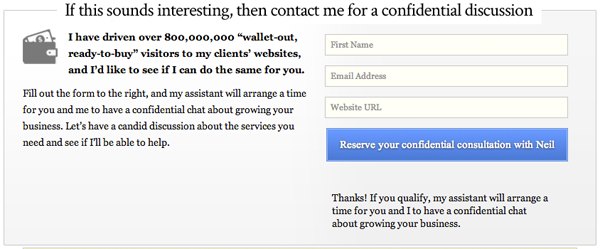
If your website offers a service, then your contact form shouldn’t try to sell that service. It should only try to get your foot in the door by asking a few basic questions. NeilPatel.com was able to increase conversions by 26% by removing 1 field from his contact form.
2. You Ask for Their Phone Number
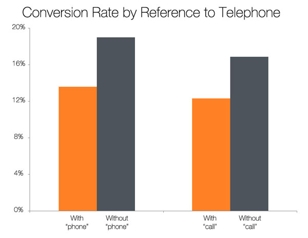
We humans hate giving out our phone numbers, especially to sales people. Can you blame us? We have no idea how pushy that sales person is going to be. I used to think requiring a phone number qualified our leads, and that a potential customer wasn’t serious if they couldn’t give us their phone number. Not any more. Data doesn’t lie, and the data shows that asking for a phone number will kill your conversions.
In 2010, Dan Zarrella of HubSpot analyzed over 40,000 landing pages and found that asking for a phone number was one of three fields that killed conversions rates.
3. You Ask Your Visitors to “Submit”
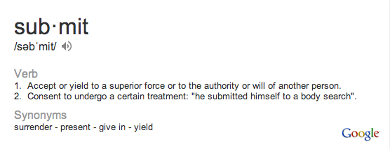
The word “submit” is such a negative word. Who wants to “submit” to anything. I’d rather “Send” or “Send Email”. Actually, “Click Here” and “Go” have the best conversion rates.
Here’s how Google defines the word, “submit”.
4. You’re Not A/B Testing
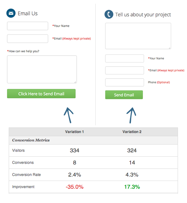
Don’t overcomplicate A/B testing. In this case, it’s simply showing equal groups of visitors different forms and seeing which one converts the most. At The Ocean Agency we tested two different contact pages. Each page showed a slightly different form. Using a simple WordPress plugin like MaxA/B Testing The Ocean Agency doubled the amount of conversions.
5. You Don’t Have Enough Forms
Have you ever gone to the store and ended up buying things you never intended on buying? That’s called “Impulse Buying”. Stores take advantage of this by strategically lining the checkout lanes with goodies to buy. You should take advantage of the fact that humans can often be impulsive. On The Ocean Agency website there is a contact form in the footer of every page, in the body of almost every page, and of course on the Contact Page. We’ve done this for years and found that very often our visitors will fill out a contact form because it’s right in front of their face.
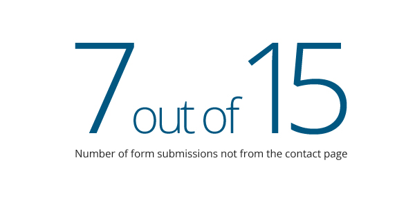
We also track which conversions came from which pages. From that we are able to tell that 7 out of 15 recent contact form submissions came from contact forms on other pages, like the body of the Home Page.
Conclusion
Everything you see above can be done in less than one day. Put your clients aside for one morning, meet with your developer and get it done.
If you have anything to add please comment below. I’d love to hear more ideas.

